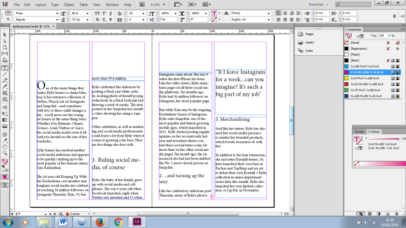
For the text, I have made the layout as simple as possible after my research looking at other high-fashion magazines. In Glamour and Vogue, they place large amounts of texts n white backgrounds usually with nothing else added. I have done the same with my text.

Though it may look un-interesting to some, I think the way the text is spread out makes it way easier to read than if there were pictures surrounding the text. I have used some quotations in the top right corner, and using a numbered list made it easier for the reader to become involved.
