
Category Archives: Creative Futures – SallyFirby
Life Magazine: National Press
Life Magazine: National Press
I have decided to focus my essay on Life magazine, Life was founded in 1883 as a partnership between John Ames Mitchell and Andrew Miller in an artists studio down Broadway. Miller served as secretary/treasurer and founded the magazine’s business side well. Mitchell, a 37-year-old illustrator who used a $10,000 inheritance to invest weekly into the magazine, took advantage of a revolutionary new printing process using zinc-coated plates, which improved the reproduction of his illustrations and artwork. This cutting-edge use of fine illustrations proved imperative in the competition of stiff-faced yet best-selling humor magazines Judge and Puck, which were already established and largely successful. The motto of the first issue of Life was “Where there is Life, there is hope.” The magazine set forth their principles and policies to their readers when they wrote “…we will speak out what is in our mind as fairly, as truthfully, and as decently as we know how.”
The real Life magazine was said to have started under the supervision of new editor Robert. E. Sherwood, a former Vanity Fair staffer. As a World War I veteran Sherwood tried to inject some sophisticated humor into the pages of Life, the magazine began to publish Ivy League jokes, flapper sayings, cartoons and anything burlesque. Beginning in 1920 Life took a crusade against prohibition, which made them extremely popular in the eyes of the public. The magazine began to be the house-hold name everyone was talking about. Their bravery in the face of illegal substances (alcohol, spirits ect.) and their sophisticated yet witty humor about the situations made them a liaison for conversation starters.
In 1920 Life had over 250,000 readers and counting, that was until the Jazz age entered the great depression the magazine took a large hit and lost money and subscribers. By the time Maxwell and Editor George Eggleston took over, Life had switched from publishing weekly to monthly. From then the magazine lost its standing and was slowing sliding into financial ruin with other competition rising from Balleyhoo, Hooey and Esquire. Life was pronounced a failure and came to its end in 1933.
Luckily a short time after in 1936, an investment was made by publisher Henry Luce who paid for the name of Life to be transferred onto his company then Time inc. Henry Luce believed that pictures could tell a thousand words and not just compliment a story, so he launched Life on November 23, 1936. The third magazine published by Luce, after Time in 1923 and Fortune in 1930, Life developed as the photo magazine in the U.S., giving as much space and importance to images as text in the magazine. Life remained one of the nation’s favourite magazines again and the name lived on, the magazine celebrated their 50th anniversary in 1986 with an issue fully dedicated to all the past covers of Life starting 1936 to 1970.
In 1991 Life sent correspondents to The Gulf War to investigate and capture the true essence of the War, for these issues Life took the name Life in time of War. Life was struggling financially and in 1993 they announced they would print on smaller paper starting the following year, a huge change for a company with an outstanding social value. The magazine continued to struggle in a changing world until March 2000 when the company Time inc. announced they were going to cease the print of the magazine 8 issues from the release date. This came as a shock to many as Life was present in many houses across the United States.
Lifes online presence began in 1990 as part of the pathfinder network, Life.com was launched March 31st 2009, while the archive of Life, known as the LIFE Picture Collection, was large and viewed many times, they looked for a partner who could give them the contemporary photography they were looking for. So they approached Getty Images, the world’s largest licensor of photography on the internet. The site which stemmed from this partnership offered millions of photographs from their combined collections. On the 50th anniversary of the night Marilyn Monroe sang “Happy Birthday” to John F Kennedy, Life.com presented Bill Ray’s iconic portrait of the actress, along with other rare photos showing they still had a valuable presence, if not only online.
Life was also taken and adapted into the new film, The Secret Life of Walter Mitty, starring Ben Stiller and Kristen Wiig, portrays Life as it transitioned from printed material toward having only an online presence.
Such a large change from Life to go from copper-plated printed press of a weekly magazine to an online photography sharing centre and then to Life.com surely shows the adaptation of journalism as a whole, not all magazines and newspapers would switch to being soley an online presence but in the age of technology many have had to create one none-the-less. The list of companies who have adopted an online presence; such as a Facebook page or a Twitter account, Tumblr, Google+, Instagram just to connect with the large percentage of people who get their information from the internet now, would be endless.
True change happened for Life in 2008 when an unlikely partnership was made between Life and Google. Google, being one of the biggest search engines and globally known internet access-all phenomenon, began hosting an archive of the magazines photographs in partnership with Life to celebrate the many works added to the covers and stories by well-known photographers. The archive was home to over 6 million photographs and are all still largely available on Google’s Cultural Institute and simply by Google search.
In conclusion, Life magazine underwent many years of traditional printed press if not in such traditional methods. They were a magazine ahead of their time and dosed the public with a sense of witty, sophisticated humour that bred a generation with knowledge. They then had the sense to preserve their name and live on in a photography-based revamp, ensuring that their pages were interesting and shocking in the best ways. To then become an online archive of their past using the latest technology and partnerships with some of the biggest internet companies will surely always be known as one of the largest changes in Journalism.
Lucidpress: Sally
Lucidpress was a website which allowed me to make a 4 page spread for a magazine using techniques and apps from the website. The website was fairly easy to use and allowed you to easily add your own text and images. This brought the spread to life as the images complimented the story.
This lucidpress tells the story of the Fruit Market on Humber Street in Hull, whats happening and what is going to be happening to and in the area.
Immersive Websites: Sally
Lose yourself in a world of web design gorgeousness with these incredible online experiences.
Some are single-serve only, designed to help attract attention or investment. Some were built purely on a creative whim, designed to inspire others to experiment.
Others are fully immersive experiences, where you have to devote significant time to explore the highly detailed worlds on offer.
All are inspiring though and hopefully these examples will prove that the internet is just one great big experimental playground, where rules aren’t necessarily set in stone
The Immersive websites I chose are
The Wilderness Downtown

The Wilderness Downtown is an immersive website as it allows the viewer to interact via postcode and shows a 5 minute feature of pop-up style ads to convey the unnatural nature of the internet. Meanwhile the website pop-ups show pictures of nature and greenery of local surroundings to your area, and the viewer watches as their selected postcode area is returned to a wilderness.
Reflektor

Reflektor is a website from the band Arcade Fire for their new album Reflektor. The website immerses the viewer in a captivating music video which you can interact with by moving the mouse and clicking on the protagonists faces and items they hold ect.
Interstellar

Interstellars website is immersive as it drags you through the story of the movie without giving away the plot. You awake as an astronaut lost in space a few miles from the craft and you have to use your mouse and keys to find a way back aboard the ship. This accompanied by factual stories makes the website truly immersive.
Design: Sally
Styles of Storytelling
Cultivating compelling long-form content.
People retain 80% of what they see, 20% of what they read, 10% what they hear. 65% of people are visual learners.
Visual content
- content with visuals gets 94% more total views.
- visual content is 40X more likely to be shared on social media
- visuals are processed 600,000x faster than text
- 90% of information sent to the brain is visual
Longform
- Interactive reports
- investigative reports
- in-depth reports
Value
- thought leadership
- increased audience engagement
Styles of Story telling
Classic storytelling: Moral statement behind message
4 elements of classic story telling
- Message – Moral statement is central theme
- Characters – Heroes, supporters, adversary
- Conflict – Driving force of a good story
- Plot – The flow and how events progress
Public narrative: Persuasive, drives action
- Story of self – Call of leadership
- Story of us – Shared values, shared experience
- Story of now – Strategy and action
Creative nonfiction: Vivid descriptions of factual information
- Factually accurate – Rooted in facts
- Narrative – Written with literary style and technique
8 Purposes
- Demystify – Make a topic understandable to others
- Immerse – Details draw reader into screen
- Profile/characterize – Depth in writing
- Explain – Describe an object, process, phenomenon or event
- Engage – Engage quickly and leave contemplating
- Narrate – Beginning, middle and end
- Instruct – Respond to the question How?
- Argue/persuade – Persuade an audience to change opinion
Wixx Website Maker
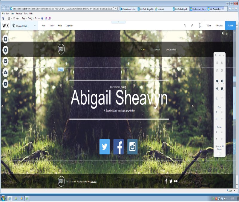 I was asked to create my own website portfolio using any online free website creator, I chose Wix as their creator was easy and simple to use. I found the website extremely helpful in the set up of the theme and finding your own voice to display your website. I also appreciated the added features like linking to you Facebook, Twitter and Instagram. They also had features such as adding your own music to the website and adding new pages for information or how to share comments with the website.
My Wix Website URL is abigailrosesheavyn.wix.com/the-artist
you’ll see it has all the required aspects such as:
- Home
- About Me
- Gallery (names landscapes)
- Contact page
Creative Futures: User Experience (sally)
Design has come a long way in the computer age, there aren’t many types of advertising which dont involve design, or many Journalistic jobs that dont have design elements running through them. WIth the age of technology making design easy with apps and software it is easier than ever to make what used to be fantasy, reality. This means that designing can really hit it’s audience and even be created to be emotionally stirring.
Don Norman wrote The Design of Everyday Things and is the director of the Design Lab at the University of California. In his book The Design of Everyday Things, Norman uses the term “user-centered design” to describe design based on the needs of the user, leaving aside what he deems secondary issues like aesthetics. User-centered design involves simplifying the structure of tasks, making things visible, getting the mapping right, exploiting the powers of constraint, designing for error, explaining affordances and seven stages of action.
Everything we use on a daily basis reflects who we are as consumers and what we like in terms of design, from the toothpaste we use to tea or coffee we drink. Design can make us feel. And sometimes not in the way we expect.
I have chosen 2 videos which, to me, show emotions through design.
This Lloys advert is for their 250 year anniversary and uses a mixture of music, camera angles, footage and branding to really connect emotionally with the viewers. The symbol for Lloyds bank is the Black Stallion. Throughout the advert there are many horses uses to be a visual representation of the bank. They are there during house fires, during riots, during the war and throughout 250 years of flashbacks. This implies that Lloyds bank have been there throughout all the disaster and building of Britain. The music is the song “Wings” by the popular singer-songwriter Birdy. The song is emotional and goes well with the emotinal feel of the video.
