InDesign

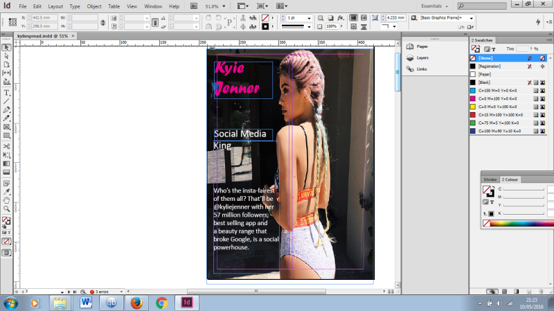
Another update to my InDesign piece for Dave Eccles, I have created the Contents page after looking through more Glamour Uk and Vogue magazines, I have also decided to keep this simple. kj1.png

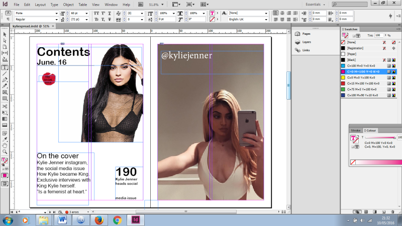
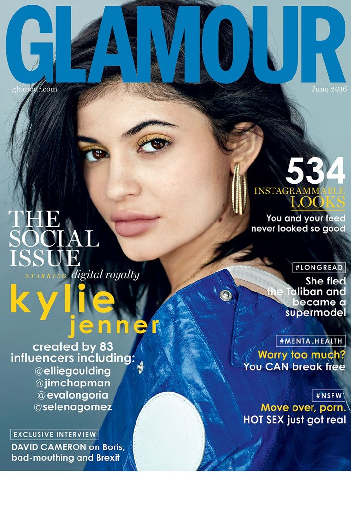
For the Contents page I basically copied the layout of Glamour, they used barely any text and what text they did use was to show emphasis on the cover story. For this I used a picture of Kylie that would fit into the white background, keeping with the simplicity of Glamour. The added graphic below the date was drawn by me using the pencil tool, as I saw something similar in Glamour. Inside it says “the social issue” yet again emphasizing the cover story and that the issue will be a social media one. The next page on the right is a blown up photo that Kylie used on Instagram to promote her swimwear (and make-up) through my research most magazines will put in a page or two of just large photo’s and quotes, instead of using pics from a photoshoot I have chosen to use her social media pictures as they have generated her infamy (which is what the article is about).

InDesign

kj


Ive been working on the Kylie Jenner piece for a few weeks now, and Iv’e changed from the normal font I was using (calibri) to Forte, this makes her name stand out on the page. The style of the front cover was to imitate that of an actual magazine cover, with slight indication to what the story inside is about and the theme of the story (Social Media King). Kylie Jenner is in hot pink writing as she is known to be quirky and a risk taker when it comes to fashion. I have used a picture which she uploaded to Instagram, to follow the theme of the article. Her instagram being her main point of endorsement for her fashion and make-up lines. InDesign made this easy for me as it’s simple to upload a picture and fit it to scale of the magazine page. I will be using more of her Instagram posts throughout the process to keep with the social media theme of the text.

InDesign

For Dave Eccles work on InDesign we were told to find a piece of writing that we would take and set out in a magazine style format. I chose my text to be from glamour magazines June edition about Kylie Jenner and the impact of social media. This is relevant to the course as a whole as we are currently learning about the impact of social media in journalism.


I researched the techniques and styles used by buying magazines such as Glamour UK and Cosmopolitan and Vogue. Their styles rarely vary from the minimalism-chic, with large pieces of text stuffed in between full pages of images (usually from photo-shoots) and large quotations placed over the images. The text itself seems to be a basic Ariel bold, size 18/24 and placed in easy to read blocks. The magazine Glamour only uses two columns, which I have opted for in my spread design. I think this gives the illusion of less text.Glamour-Jun16-Cover_b

Two Photojournalists: CATS

Steven McCurry has been one of the most iconic voices in contemporary photography for the last 30 years, with magazine and book covers, over a dozen books and countless exibitions around the world I chose Steven Curry for exploring India, Pakistan, Tibet, Afghanistan, brazil and many more countries with a backpack of clothes and his camera, capturing the true essence of Indian life and culture.

Steve McCurry

Steve McCurry

steve-mccurry-1500x931 an image by Steve McCurry from Tibet


David Burnett

David Burnett was a freelance photographer for Life  and Time magazines in both the US and later on Vietnam for two years. He open his own agency though was still very dedicated to his art, for 30 years he travelled the world to events like the Olympics, political campaigns, even photographing celebrities such as Bob Marley. His best known work was during the Iranian revolution.

Photojournalist: Don McCullin

Don McCullin – Redundant Warrior

Don McCullin is a British photojournalist recognised for his war photography and images of urban life. He examined the underside of society, photographing the unemployed, downtrodden and impoverished. The video Redundant Warrior depicts the traumatic and tragic events in which Don McCullin produced some of his greatest work. Living beside starving children in war torn, famine torn countries.

The images show the devestation of war to the soildiers, holding each other up during battle to the starving children on the side of the street. He says “we’re looking at the most appauling and tragic situations….no matter who’s army or war it is it’s an awful situation.” he took a chance photographic dead soldiers in the battlefield. His morality asked himself if it was the right thing to do, but said he walked that line with a dark concience and sometimes even felt criminal for his actions.

After seeing the horrific nature of war the events took toll on McCullin, who found happiness a strange thing to come back home to. His work reflects the torment of the mind with the dark, piercing images of death and dispair. Which is what his work should reflect, a natural disgust to the injustice war brings.

Graphic design: Eccles

First draft:

roselogo

Reasons I have chosen this design for my 1st draft:

  • This font recalls the crisp, elegant geometry found in some of the best American styles from the 1930’s and 1940’s. Among other uses, Niagara is typically recommended for Newspaper, Magazine, Book and corporate use.
  • With my brand/logo I want to incorporate myself into the design, stuck for idea’s I searched through my previous research and inspirations and was caught again by Apple’s recent use of rose gold products. My full name is Abigail Rose Sheavyn, and so to show my brand as my own I have decided to incorporate a rose symbol
  • I was going to do my design in monochrome anyway, but I have found that having white text on a black background looks better and makes the brand name (my name) stand out against the back.


Graphic design: Eccles

Fonts.

After many hours looking through fonts, changing fonts, deciding finally it will be this font and then changing it back to the second font again. I believe I have found the font I want to be in my design. Instead of making a font (which would probably be terrible) I have decided to use the font in illustrator, Niagara Solid. niagara-solid_font_preview

This font recalls the crisp, elegant geometry found in some of the best American styles from the 1930’s and 1940’s. Among other uses, Niagara is typically recommended for Newspaper, Magazine, Book and corporate use.

Graphi Design: Eccles

Finding my brand.

With my brand/logo I want to incorporate myself into the design, stuck for idea’s I searched through my previous research and inspirations and was caught again by Apple’s recent use of rose gold products. My full name is Abigail Rose Sheavyn, and so to show my brand as my own I have decided to incorporate a rose symbol. This required me to find a picture of a rose that I could modify to place in my design. rose

This is the rose I have chosen, after removing the stem and leaves which surrounded it. I want my brand to be clean-cut, minimal and simple. Removing the leaves means the rose standing alone looking simplistic, bright and eye-catching.

Graphic Design: Eccles

Research.

For my research into my logo and branding project I have looked through mainly minimalist approaches to design through my own personal tastes. In my search for unspecific logo’s to draw inspiration from, I have found the following simple

This style of minimalism is kind of what I hope to achieve, monochrome colours achieve a sense of professionalism that cannot be ignored. The use of decorative font for the name implies a human and personal feel to the brand. The designer has used typical Times New Roman style font for his Creative to assert the brands exclusive nature.

Although I like the monochrome tone of this piece of design, I will add colour to my final work. For my colour selection I have drawn from well known brand Apple (specifically iPhone’s 6+) the colour of the newly released iPhones are light gold, light silver, black and rose gold.

As the rose gold colour is very popular with people who buy Apple products in general I have thought about incorporating this into my design. iPhone products themselves are described in design as simplistic and beautiful, which I want my brand to convey a sense of sensory pleasing and professionalism. The colour connotes Apple and their brand, portraying my design as exclusive, desired and high end.

13

In my search for logos and designs with my initials for inspiration I came across this AS (for Adam Smith) which is minimalist, with no logo other than the initials. But here I did find the inspiration for my design as reversing the field (light on dark) modifies the look. I was going to do my design in monochrome anyway, but I have found that having white text on a black background looks better and makes the brand name (my name) stand out against the back.

National Newspaper: New Day

New Day, an analysis of the new National Newspaper.

New Day made it’s eye-catching debut with a free issue that seemed more magazine than newspaper, designed to be a feel-good, colourful, sub-editorial collection that lives up tp it’s promise of being a breath of fresh air to newsstands.

The design screams new and alternative, beginning with the masterhead – turqoise or duck egg blue. The blue colour significant to todays focus on social media, most social media sites having a different shade of blue in their design. Along with digest-style news pages, big pictures and short features.

newdaynews

What the editor Alison Phillips and her team have delivered is a part Metro, part i, part womens style magazine and made it a distinctive daily newspaper. Their are 40 pages of fast paced, interesting features which shouldn’t be taking people long to digest. Lacking in politics their content is mostly light-hearted and upbeat, perfect for heir target audience aged from 35-55.

Given the design and niche of this magazine, I think it will do rather well with competing newspapers. The shorter, more interesting and feel-good vibe New Day has is perfect for the target audience that spends large quantities of their time on their phones looking through Buzzfeed and Lad Bible articles. Supposedly they’ll be tricked into picking up the paper thinking it’s a Facebook page and hopefully read some interesting news about the local community instead of Kylie Jenner’s favourite food spots.